
Faceless YouTube Thumbnail Strategy — What the Data Says in 2026

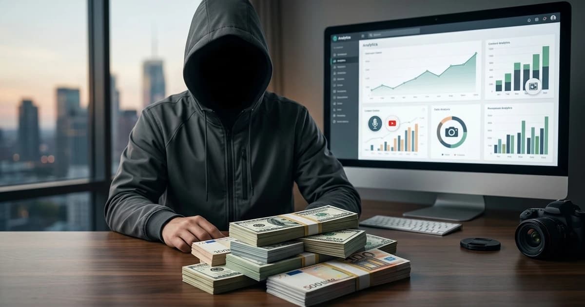
Faceless YouTube channels are no longer a niche category — they publish more than half of the top-100 fastest-growing channels of the past twelve months, and the thumbnail conventions that got them there have shifted meaningfully. What worked in 2023 (dark background, neon yellow arrow, three-word title in Impact) is now the pattern most audiences skip. This post is what the current top-performers are actually doing in 2026, broken down by lever, with the specific decisions you can steal for your own channel.
No listicle. No "trends to watch." Just the patterns pulling the clicks right now, and the automation stack sitting behind them.
Prerequisites
- A faceless channel (or a plan to launch one)
- YouTube Studio access so you can compare your CTR against the benchmarks below
- Willingness to look at your last 20 thumbnails against the current pattern set — most of what you'll change is a couple of decisions, not a full rebrand
Everything below is about the decisions that get baked in before the pixel work starts. Once those are right, the execution scales.
What "Faceless" Actually Means in 2026
Two years ago, "faceless" meant no human in the frame. In 2026, the definition has drifted: the top channels routinely include stock faces, AI-generated characters, cropped hands, or silhouettes — anything that isn't a specific known creator. What matters for the format's psychology is the absence of the parasocial anchor: the viewer clicks because the topic is interesting, not because they trust the specific person on screen.
This distinction changes the strategy. A pure text-and-graphic thumbnail (Kurzgesagt-style) is one legitimate faceless shape. A cinematic still with a cropped hand or a shadowed figure is another. Both are now common in the top-100. The wrong move is treating "faceless" as a design constraint — it's a category, and inside it there are three or four winning visual languages, not one.
The Four Dominant Faceless Visual Languages of 2026
Across the top-performing faceless channels, four visual languages are pulling the majority of clicks. Not exhaustive, but the ones you'll see over and over if you scroll browse feeds in the largest niches.
1. Cinematic Realism
- Look: photorealistic hero image, shallow depth of field, dramatic lighting. Bold 2–4 word overlay on the empty half of the frame.
- Where it wins: documentary / narrative channels (history, true crime, science explainer), Reddit-story reads with atmospheric backgrounds.
- Why it works: the imagery signals "high production value" before any text is read. It's the visual equivalent of a movie poster.
2. Iconography + Bold Typography
- Look: flat colour block or subtle gradient background. One large icon or graphic element. Bold typography carrying most of the message.
- Where it wins: tech/SaaS explainer channels, business/finance analysis, faceless tutorial content.
- Why it works: the icon is a fast topic cue; the typography carries the hook. Almost zero visual noise means the eye lands on the message in under 200ms.
3. Data Visualisation Foreground
- Look: a chart, graph, or number takes the centre of the thumbnail. Text is either the number itself (e.g. "$47M") or a short frame around it.
- Where it wins: finance channels, sports analysis, business breakdowns, science explainers dealing with real numbers.
- Why it works: a chart signals "this is analysis, not opinion." The number itself is a curiosity hook — the eye asks "of what?"
4. Character or Persona (AI or Stock)
- Look: an AI-generated character, a stock face, or a stylised silhouette in the frame — often paired with an emotion (surprise, focus, concern).
- Where it wins: Reddit-story reads, top-10 listicles, self-improvement channels, faceless commentary.
- Why it works: the fusiform face area (the brain region specialised for face processing) fires on any face, real or synthetic — so the eye-grab benefit is there without the creator being on camera. The YouTube thumbnail psychology breakdown covers why this half-second reaction is the entire game.
What the Data Says About Colour in 2026
Two shifts worth noting from the 2023–2024 conventions:
- The neon-yellow / dark-blue palette is oversaturated. It still works, but the marginal benefit is gone in most niches — every second thumbnail looks like it. Pattern interruption is now the differentiator, and if everyone is on that palette, breaking it (soft pastels, monochromatic photography, high-key whites) is what draws the eye.
- High-key white and light-palette thumbnails are outperforming in tech and business. The dark-mode feed makes them stand out. This is a genuine 2026 shift — as recently as late 2024 the conventional wisdom was the opposite.
The rule of thumb hasn't changed: pick a palette that contrasts against the surrounding feed, then push saturation higher than feels comfortable on a desktop preview because everything looks flatter on a phone at scroll speed.
Typography — Where Faceless Channels Still Get It Wrong
The single most common faceless-thumbnail mistake in 2026 is still text density. Six-word titles, small type, thin stroke — invisible on a phone. The top channels have converged on:
- Two to four words of overlay text. Never more. If the hook doesn't fit, it isn't a thumbnail hook — it's a title.
- Black or extra-bold weight sans-serif. Regular and medium weights vanish at 320×180 render size.
- A 4–8 pixel dark stroke or drop shadow around light text (or vice versa). This one change alone moves CTR by 1–2 percentage points on most channels.
- Numbers, superlatives, and personal pronouns carry the most click weight per character. Cut articles and filler adjectives.
Fancy hand-drawn typography looks great on the desktop preview and dies on mobile. Legibility beats novelty every time in the browse feed.
Layout Patterns Pulling Clicks Right Now
Three layout patterns dominate the top faceless thumbnails in 2026:
- Split-half. Visual on one side, text on the other. The horizontal split reads faster than centred layouts and works on every niche.
- Top-anchored text, bottom hero image. Text goes in the top-third where the eye lands first on mobile; the visual anchors the bottom two-thirds. Works especially well for cinematic-realism thumbnails.
- Centre focal + edge text. One dominant central element (a chart, a character, a product), with short text hugging one edge. Works for data-vis and character-based thumbnails.
Avoid: centred text over a busy background, four-corner text arrangements, or any layout that requires reading order to make sense. The eye scans left-to-right on desktop and top-to-bottom on mobile — build accordingly.
The Automation Stack Behind the Top Faceless Channels
Every high-cadence faceless channel that ships more than 3–5 videos a week has automated the thumbnail step. The stack most operators have converged on:
- Content pipeline (script → TTS → edit → render) writes a metadata JSON when the video is ready.
- Thumbnail API call takes the title and (optionally) a per-channel style reference set, returns a 1280×720 WebP.
- YouTube Data API upload attaches the thumbnail to the video and publishes.
This is exactly the shape the faceless channel thumbnail automation pipeline walks through end to end. For operators running a network of channels rather than a single one, the multi-tenant version lives at the YouTube automation channel use case — same shape, plus a per-channel style registry so each channel keeps its own visual signature.
The tool sitting in the middle of that stack for most 2026 operators is a generation API. ThumbAPI is the specialised one — one endpoint takes a title and a format (youtube for 1280×720), returns a finished thumbnail in under 30 seconds with the layout patterns above already baked in. For the underlying design conventions across formats and niches, the best thumbnail styles for 2026 rundown is the deeper cut on what to build reference sets around.
What Not to Do in 2026
A short list of the patterns that used to work and now underperform:
- The red circle around a face or object. Everyone did it. Audiences are trained to skip it.
- "You won't believe" phrasing. Generic curiosity gaps have lost their weight — specificity wins.
- Chained emoji. 🔥🔥🔥 was novelty in 2023, is noise now.
- Photoshop-obvious composites. The half-cutout floating in front of a gradient looks dated. Cinematic realism has replaced it.
- Templates left running for 12+ months without a refresh. Style ages. Anything that hasn't been updated in a year looks it.
Under the Hood — Why Style Matters More Than Novelty
The generation model behind ThumbAPI is grounded in a dataset of high-performing thumbnails that gets refreshed continuously. That's the operational reason the layouts, palettes, and typography that come out today match what's actually working in feeds today — not what was working when the model was trained. It's also why templates go stale so fast in this category: the underlying visual language moves, and if your reference doesn't move with it, your thumbnails start looking like archaeology inside a year.
The practical version for operators: build reference sets from your own recent top-performers, refresh them every quarter, and let the AI handle the composition. That's the loop that keeps the visual identity consistent and current — the two goals most manual template systems can't hit at the same time.
Ship a Better Faceless Thumbnail Today
The 2026 faceless-thumbnail playbook is:
- Pick one of the four dominant visual languages (cinematic, iconography+type, data-vis, or character).
- Keep overlay text to 2–4 words with a bold weight and a dark stroke.
- Use a split-half or top-anchored layout — never centred over a busy background.
- Refresh your reference set every quarter as feed conventions shift.
- Automate the generation step so cadence isn't the bottleneck.
Start free with 50 credits per month — enough to test the API against your last 5 titles and check CTR against your baseline. That's the only real proof of what works for your channel.

Written by
Aldin KozicaFull-stack developer from Bosnia and Herzegovina. I built ThumbAPI because I kept watching content teams waste hours on thumbnail design when the patterns are predictable enough to automate. The API is the tool I wished existed when building content pipelines for my own projects.
Continue Reading
An in-depth analysis of thumbnail strategies for faceless YouTube channels: what works, what doesn't, and how to automate faceless thumbnail creation at scale.
The Math of Automated SEO: How We Build Programmatic Pipelines in 2026Why manual writing fails at scale, how programmatic SEO pipelines work under the hood, and what the raw math says about indexing, traffic, and dev workflow.
Thumbnail API vs Manual Design — Real Cost Comparison With NumbersThe real cost comparison between designing thumbnails manually (Canva, Figma, Photoshop, freelancers) and calling a thumbnail API — time, dollars, and CTR trade-offs, broken down for 30, 100, and 1000 videos per month.
What Is an OG Image and Why Every Blog Post Needs OneOG images are the 1200×630 previews that appear when your link is shared on Facebook, LinkedIn, Slack, Twitter, or Discord. This guide breaks down what an OG image is, why it matters for CTR, the specs that actually matter, and how to ship one per post automatically.
Generate Thumbnails With an API
Try ThumbAPI free. 50 credits per month, no credit card required. One API call, production-ready output.