
How Thumbnail Design Affects the YouTube Algorithm and Impressions CTR

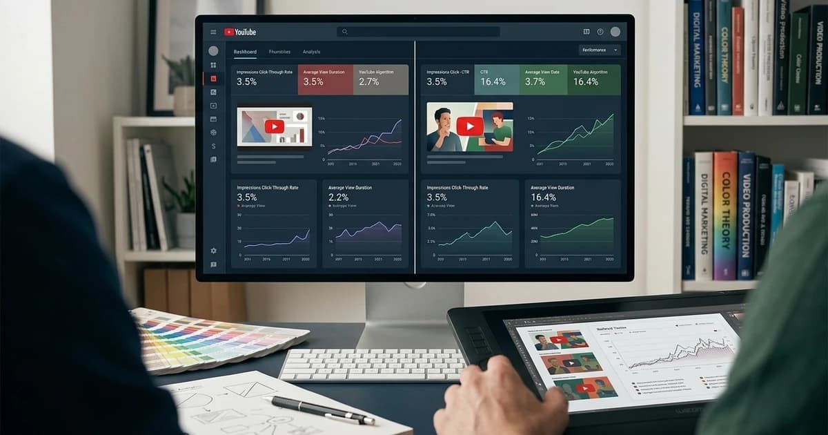
The YouTube algorithm is not a mystery, and thumbnail design is not a soft variable inside it. The recommendation model reads impression → CTR → watch-time as a single feedback loop, and every design decision on your thumbnail is a bet on which slice of that loop you want to win. Design for CTR alone and you gamble your watch-time floor. Design for watch-through and you cap your impression velocity. Design for both — deliberately — and the algorithm compounds you.
This post breaks down what the 2026 YouTube model actually rewards, how thumbnail design steers each stage, and the specific loops (impressions rising, CTR plateauing, watch-time drifting) that let you diagnose which of the three stages is your current bottleneck.
Prerequisites
- A channel with at least a few hundred videos of history, so the algorithm has enough signal to work with
- Access to YouTube Studio → Analytics → Reach tab (impressions and CTR data)
- Rough baseline: your channel's average impression CTR (usually 3–8%) and average view duration
- Familiarity with the YouTube CTR fundamentals — this post assumes you know why CTR matters and dives into what the algorithm actually does with it
The Three-Stage Loop the Algorithm Runs
The recommendation system does not evaluate videos as monolithic assets. It runs three separate scoring stages, and thumbnail design touches all three:
- Impression scoring. For a given viewer session, the model picks which candidate videos to even show. Thumbnail metadata (topic, freshness, prior engagement) affects candidate selection here, but the thumbnail itself is not what gets scored — the video's history is.
- Click scoring (CTR). Once a video appears in an impression slot (browse feed, suggested rail, search result), the thumbnail + title combo determines whether the click happens. This is where thumbnail design does its heaviest lifting.
- Retention scoring (watch-time share). Once clicked, the video's actual retention curve gets logged. High CTR with weak watch-time is a red flag to the model — it reads as a clickbait mismatch and suppresses future impressions.
The loop is: strong thumbnail earns clicks → clicks compound into impression velocity → impression velocity drives up the delivery pool → the pool exposes the video to viewers with weaker topical fit → CTR softens → the model slows delivery. That's the compression cycle every "going viral" video eventually hits.
Impressions vs CTR — Which Comes First
New creators usually assume impressions are given by the platform and CTR is the only lever they control. That's backwards. Impressions are scored, and thumbnail-driven CTR is what pumps future impressions. Two feedback signals matter:
- Session CTR. How often the thumbnail earns a click when it appears. Anything meaningfully above your channel's baseline pulls the video into more impression slots.
- Session watch-time share. How much of the session budget your video captures once clicked. High share means the model steers more sessions toward your channel; low share means the video was a diversion.
Both are downstream of thumbnail design. A crisp, high-contrast thumbnail with a clear promise wins session CTR. A design that accurately previews the content wins watch-time share. If either is broken, the impression flywheel stalls.
The Design Levers That Actually Move the Algorithm
Five thumbnail design levers correlate with algorithm-driven impression lift, in rough order of impact:
- Face presence and emotion. Faces beat no-face across ~80% of niches. Emotional face (surprised, focused, laughing) beats neutral face. The eye-tracking research the thumbnail psychology guide walks through explains why — but the algorithmic effect is downstream: higher CTR pulls more impressions.
- Text density and readability. Two to four bold words above ~60px source-scale is the working range. Text-heavy thumbnails (a full headline crammed in) underperform because they don't read at browse-feed scale. Every unreadable pixel is a click lost.
- Colour contrast against feed neighbours. Warm-dominant thumbnails on a mostly-cool feed (or vice versa) get the eye-catch bump. Sameness — every video in your niche using the same red-and-yellow palette — trains the eye to skip.
- Focal point and gaze direction. Left-anchored composition with the face looking right (toward the text) outperforms centre-anchored designs in most niches. Mobile browse feeds crop more aggressively at the edges, so keeping the focal point in the middle 80% is table stakes.
- Consistency across your channel. A recognisable house style pays off in session-level CTR — viewers who already trust your channel click faster when the thumbnail carries your visual fingerprint. This is where uploading a reference set of your best-performing past thumbnails changes the game. Which style to lock in depends on your niche — the thumbnail style by niche playbook covers the specific visual patterns that win in tech, finance, education, fitness, and other categories.
Diagnosing Where Your Loop Is Breaking
Every underperforming video has one of three failure patterns, visible in YouTube Studio → Analytics:
- Low impressions, low CTR. The model isn't testing the video widely because early impressions don't earn clicks. Thumbnail is failing at the CTR stage. Fix: rework the thumbnail — variant test 2–3 designs via thumbnail A/B testing and let YouTube's Test & Compare pick.
- High CTR, low retention. The thumbnail is over-promising and the video isn't delivering. Model reads this as clickbait and throttles impressions after the first 24–48 hours. Fix: tone down the thumbnail promise or improve the video's opening 30 seconds.
- High impressions, high CTR, but plateaued watch-time. The model is delivering the video to viewers who click but don't retain — usually because the audience pool is drifting outside your topical core. Fix: less about the thumbnail, more about which video content signals you're giving the model.
The interesting one is pattern #1 combined with pattern #2 (low CTR and low retention). That combination is usually not a thumbnail-only problem — it's usually a mismatch between the topic and the audience you've trained the algorithm to send you. Fixing the thumbnail alone won't unstick it.
The 2026 Model Change Worth Knowing
YouTube's recommendation model shifted meaningfully in 2024–2025 toward session watch-time — the total time a session spends on YouTube after clicking your video — rather than just the retention on that single video. Thumbnails that route sessions into your channel (playlist auto-plays, related video pulls) are worth more than thumbnails that end a session cleanly.
Practically: a thumbnail that clearly signals which series or channel the video belongs to gets a small compounding lift because the model expects the click to extend into more of your videos. This is why channel-consistent branding (logo overlay, reference-set-driven style, recognisable typography) has moved from a nice-to-have to a genuinely algorithmic factor.
The Under-the-Hood Bit — What the Model Actually Sees
The recommendation model doesn't read your thumbnail pixels. It reads:
- Per-impression click-through rate, bucketed by traffic source (browse, suggested, search).
- Watch-time share of the session after the click.
- Downstream engagement — did the click extend the session, did the viewer subscribe or add to a playlist, did they return within 7 days.
Everything about thumbnail design is upstream of those three metrics. Get the metrics right and the algorithm rewards you; get them wrong and it doesn't care what your design looks like.
Feeding the Loop With an Automated Generator
For channels shipping 2–5 videos a week, thumbnail design is the highest-leverage recurring decision. Doing it manually caps you at whatever your design floor is; using a generator like ThumbAPI removes the floor and lets you feed the loop deliberately.
Two patterns compound well:
- Encode your winners as a reference set. Upload 3–6 of your best-CTR historical thumbnails as a custom reference set and pass
customAssetsIdon every generation. Every new thumbnail biases toward the style the algorithm already rewards you for. - Generate variants for Test & Compare. Three API calls with different
usePhoto/useLogo/categoryflags gives you three genuinely distinct variants without a designer. YouTube's native A/B tool picks the winner on watch-time-share — the metric the algorithm actually cares about.
The YouTube thumbnail API landing page covers the format endpoint end to end, and the bulk thumbnail generation walkthrough covers batch generation for backfill runs.
Ship Thumbnails the Algorithm Rewards
Thumbnail design is not aesthetics — it's an input to the impression → CTR → watch-time loop that the recommendation system runs. Design deliberately, feed the loop, and every video after the first one compounds.
Start free with 50 credits — enough to generate variant thumbnails for your last five videos and put them into Test & Compare. If you want the five-minute wire-up, the quickstart covers the first API call.

Written by
Aldin KozicaFull-stack developer from Bosnia and Herzegovina. I built ThumbAPI because I kept watching content teams waste hours on thumbnail design when the patterns are predictable enough to automate. The API is the tool I wished existed when building content pipelines for my own projects.
Continue Reading
A developer-friendly playbook for A/B testing YouTube and blog thumbnails against real CTR data. Sample-size math, YouTube Studio's Test & Compare, blog cover experimentation, and how to loop the winner back into your generator.
How to Increase YouTube CTR With Better ThumbnailsA deep, practical guide to improving your YouTube click-through rate through better thumbnail design. Psychology, data, common mistakes, and step-by-step optimization.
How to Pick the Right Thumbnail Style for Your YouTube NicheA niche-by-niche breakdown of the thumbnail styles that actually work on YouTube in 2026 — tech, education, finance, fitness, food, gaming, news, and more. What the top channels in each niche do, what to steal, and what to avoid.
Faceless YouTube Thumbnail Strategy — What the Data Says in 2026A data-grounded look at what actually works for faceless YouTube thumbnails in 2026 — palette, typography, layout, and the patterns pulling clicks in each niche. Plus the automation stack running behind the top channels.
Generate Thumbnails With an API
Try ThumbAPI free. 50 credits per month, no credit card required. One API call, production-ready output.