
Thumbnail A/B Testing — How to Use CTR Data to Pick Winning Designs

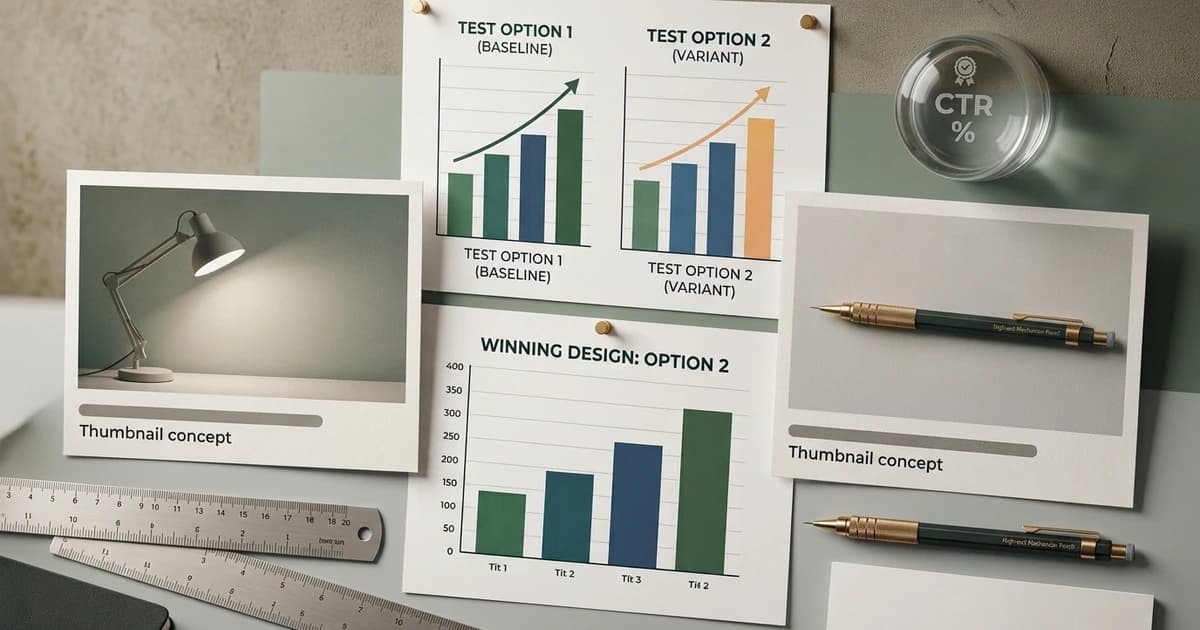
Most creators pick thumbnails the same way they pick fonts: gut feel. That works right up until CTR flatlines and nobody knows which variant is dragging. A/B testing thumbnails is the fix, and it's a lot more tractable than most creators assume — YouTube exposes the primitives directly, and for blog covers the setup is a small experiment framework you can wire up in an afternoon.
This is the developer-friendly version. Sample-size math you can trust, the two testing surfaces that actually exist (YouTube's Test & Compare and Google Optimize replacements for blogs), the common design-axes worth testing, and how to feed the winner back into an automated thumbnail pipeline so the next post benefits from what the last post learned.
Prerequisites
- A YouTube channel or a blog with meaningful traffic — testing on 200 impressions per variant is noise, not signal
- Access to your CTR data (YouTube Studio analytics, or GA4 / Plausible for blog covers)
- Rough idea of your baseline CTR — you can't know what a "winning" variant looks like without a floor
- An automated way to generate variant thumbnails (Figma with a template swap, or an API — the thumbnail API vs manual design piece covers the trade)
Why Thumbnail A/B Testing Is Different From Every Other A/B Test
Standard A/B testing assumes a stable environment. Thumbnails don't get one — CTR drifts with topic, audience mood, and the surrounding thumbnails in the feed. A thumbnail that wins on Monday can lose on Friday because the algorithm surfaces it next to a different set of videos and the visual comparison shifts. The thumbnail-design-and-YouTube-algorithm loop breakdown walks through the impression → CTR → watch-time cycle if you want the mechanics before designing the test.
Two consequences matter:
- Simultaneous tests only. Sequential tests (variant A for a week, then variant B) are useless because feed context changes between weeks. Real A/B tests randomise which variant a viewer sees on the same visit.
- Effect sizes are big, or they're noise. A 0.3% CTR lift on a 4% base rate isn't "a small win" — it's a coin flip. Thumbnail A/B tests either produce a clear multi-point delta (say 4% → 7%) or they didn't find anything.
The Sample-Size Math You Actually Need
Skip the calculators. For thumbnail testing, three numbers cover ~90% of decisions:
- Baseline CTR. Your channel or blog's current average. For most YouTube channels this is 3–8%; for blogs on social/RSS it's 1–4%.
- Minimum detectable effect (MDE). The smallest CTR lift you'd call a win. Don't chase 0.5% — set MDE at 1–2 absolute percentage points for thumbnails.
- Impressions per variant. Rough formula: at a 5% base CTR and a 1.5-point MDE, you need roughly 5,000–10,000 impressions per variant for a 95% confidence-level result. At a 2% base with a 1-point MDE, closer to 20,000 per variant.
Below those thresholds you're not testing, you're guessing with extra steps.
YouTube Studio's Test & Compare — the Native Path
YouTube shipped a native A/B test surface ("Test & Compare") inside YouTube Studio. It's the cleanest way to run thumbnail experiments for a channel because YouTube owns the impression randomisation.
The mechanics:
- Open a video in YouTube Studio → Test & Compare (previously in Beta, now widely available).
- Upload up to three thumbnail variants. YouTube requires the video to have at least ~5,000 lifetime impressions to unlock the tool on most channels.
- YouTube randomly serves each variant to a slice of impressions and measures watch-time share, not raw CTR. This matters: a thumbnail with clickbait CTR but bad watch-through loses. A thumbnail with slightly lower CTR but better retention wins.
- The test runs for up to 2 weeks or until statistical significance. YouTube declares a winner and swaps it in automatically.
Watch-time share is the right metric. Raw CTR can be gamed with clickbait; watch-time-per-impression is what YouTube's recommendation model optimises for anyway. If a variant wins on Test & Compare, it's the one the algorithm will feed harder.
Test Design — What To Actually Vary
Do not run "three completely different designs" tests. Change one axis at a time so you can attribute the win to a specific decision. The five axes with the biggest signal:
- Face vs no face. For creator-led content, presence of a person's face is the single largest lever. Test it once per topic category, then stop.
- Text density. Two bold words vs a short phrase vs no text at all. The thumbnail psychology piece breaks down why 2–4 words at ~60px+ dominates.
- Colour palette. Warm-dominant vs cool-dominant against a feed that's usually mixed. The contrast against neighbouring thumbnails matters more than absolute brightness.
- Focal point placement. Left-anchored vs centre-anchored vs right-anchored composition. Mobile crops differ, so this test is more important than most creators think.
- Emotion. Curious / surprised / confident / neutral face. Emotion swings CTR meaningfully in a way "better lighting" doesn't.
Testing three variants at once means changing one axis across three levels (e.g. no-text vs 2-word vs 4-word). Testing three completely different designs is a waste of impressions.
Blog Cover A/B Testing — the DIY Version
Blogs don't get a native tool like YouTube's. The workaround is a light experiment framework at the routing layer:
- Assign each visitor a stable variant on first hit (cookie, localStorage, or a query param signed with a hash). Sticky assignment matters — if the same visitor sees variant A on visit 1 and variant B on visit 2, you're measuring novelty, not preference.
- Serve the variant image as the
og:imagefor social share previews. Different variants live at different absolute URLs — that's the actual thing being tested, since 90% of blog-cover clicks come from social share cards. - Log which variant each visit saw into GA4, Plausible, or a self-hosted event pipeline. Bucket the CTR by variant.
- Wait until each variant has meaningful sample size, then compare. Same MDE rules apply — 1–2 absolute percentage points is the smallest signal worth chasing.
For the covers themselves, the automated blog covers use case has the pipeline for generating N variants of the same post title. Feed the title in with different category hints, different useLogo flags, or different reference sets to produce genuinely distinct variants without designing each one.
Sample GA4 Event for Cover-Level CTR
If you're on GA4, this is the minimum event shape to bucket CTR by cover variant. Fire it on every server-rendered visit to a post page.
// app/blog/[slug]/page.tsx (Next.js App Router)
import { headers, cookies } from "next/headers";
import { sendGA4Event } from "@/lib/ga4";

export default async function Post({ params }: { params: Promise<{ slug: string }> }) {
  const { slug } = await params;
  const cookieStore = await cookies();

  // Sticky variant assignment
  let variant = cookieStore.get(`cover:${slug}`)?.value;
  if (!variant) {
    variant = Math.random() < 0.5 ? "A" : "B";
    cookieStore.set(`cover:${slug}`, variant, { maxAge: 60 * 60 * 24 * 30 });
  }

  // Log for CTR analysis
  await sendGA4Event({
    name: "post_view",
    params: { slug, cover_variant: variant, referrer: (await headers()).get("referer") ?? "" },
  });

  // Render the post with variant-specific OG image already set in generateMetadata
}
Route your openGraph.images off the same cover:${slug} cookie in generateMetadata and social share previews will serve the visitor's assigned variant.
Common Mistakes That Kill a Thumbnail Test
Four failure modes cover most of them:
- Stopping the test too early. "Variant B is ahead after 800 impressions." That's noise. Wait for the sample size the MDE math calls for.
- Testing three completely different designs. You'll get a winner, but you won't know which axis carried it — so the lesson doesn't compound to the next test.
- Ignoring watch-time share on YouTube. A high-CTR clickbait thumbnail that tanks watch-through hurts the video in the algorithm. Test & Compare picks up on this; raw-CTR reporting doesn't.
- Not archiving the winner. The whole point of testing is to learn a rule ("faces beat no-face for this niche", "2-word text beats 4-word") and bake it into the default. If every test starts from scratch, the channel doesn't compound.
The Under-the-Hood Bit — Feeding Winners Back Into Generation
The loop that actually pays off long-term: test → identify winning design axes → encode them into your generator's defaults → next test starts from a better baseline.
For a channel using an AI thumbnail generator, that means:
- Upload winning past thumbnails as a reference set. ThumbAPI's
customAssetsIdaccepts 1–6 reference images per set. Every new generation biases toward that visual style — palette, composition, typography. - Encode the flag decisions. If face-forward beats faceless in your niche, set
usePhoto: trueas your default. If bold branding wins on link-card previews, keepuseLogo: truein every OG generation. - Category tuning. The
categoryparameter (13 niches) biases design toward that niche's conventions. Test which niche category outperformsautofor your specific channel and lock it in.
The custom asset datasets guide covers the reference-set mechanics in depth.
How ThumbAPI Fits the Testing Loop
For channels and blogs running consistent tests, generating variants by hand becomes the bottleneck. ThumbAPI makes variant generation a one-parameter change: same title, different category, different usePhoto/useLogo flags, different customAssetsId. Three variants in three API calls, ready to feed into YouTube's Test & Compare or your blog's cover-variant routing.
The YouTube thumbnail API landing page has the endpoint surface for channel-side testing, and the OG image API covers the blog-cover surface. For automation-heavy channels running dozens of tests a month, the bulk thumbnail generation use case covers the batch-generation pipeline.
Ship Better Thumbnails, Learn From the Data
Guessing at thumbnails is expensive at scale — every miss is impressions lost to a title that could have earned more clicks. A/B testing turns that into a compounding advantage: you learn one lesson per test and encode it forever.
Start with the free tier — 50 credits per month, enough to generate 5 variant sets for your last few videos or posts and feed them into Test & Compare or a blog-cover experiment. The quickstart is the five-minute setup if you want to run the first variant generation today.

Written by
Aldin KozicaFull-stack developer from Bosnia and Herzegovina. I built ThumbAPI because I kept watching content teams waste hours on thumbnail design when the patterns are predictable enough to automate. The API is the tool I wished existed when building content pipelines for my own projects.
Continue Reading
How thumbnail design decisions ripple through YouTube's recommendation system — the impression → CTR → watch-time loop, why the algorithm rewards click-worthy visuals, and what the 2026 model actually measures.
How to Increase YouTube CTR With Better ThumbnailsA deep, practical guide to improving your YouTube click-through rate through better thumbnail design. Psychology, data, common mistakes, and step-by-step optimization.
How to Pick the Right Thumbnail Style for Your YouTube NicheA niche-by-niche breakdown of the thumbnail styles that actually work on YouTube in 2026 — tech, education, finance, fitness, food, gaming, news, and more. What the top channels in each niche do, what to steal, and what to avoid.
Faceless YouTube Thumbnail Strategy — What the Data Says in 2026A data-grounded look at what actually works for faceless YouTube thumbnails in 2026 — palette, typography, layout, and the patterns pulling clicks in each niche. Plus the automation stack running behind the top channels.
Generate Thumbnails With an API
Try ThumbAPI free. 50 credits per month, no credit card required. One API call, production-ready output.