
How to Pick the Right Thumbnail Style for Your YouTube Niche

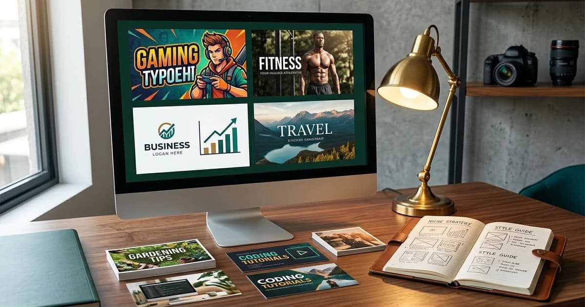
There is no universal "best thumbnail style." The design that wins on a fitness channel loses on a finance channel, and the design that wins on gaming loses everywhere else. What the top channels in each niche have in common is not a shared aesthetic — it's that they've locked into the visual language of their specific niche and stopped trying to look like general-purpose YouTube.
This is the niche-by-niche playbook. What works in tech and SaaS, business and finance, education, fitness, food, gaming, news, lifestyle, and creative-design content — the specific decisions the top-performing channels in each niche make, and the mistakes creators keep making by borrowing the wrong niche's style.
Prerequisites
- A YouTube channel or a plan for one, in a defined niche
- Ability to look at the top-20 channels in your niche and compare visual patterns
- Willingness to specialise — trying to look like every niche at once produces zero identity
- Familiarity with the best thumbnail styles overview — that piece covers the cross-niche patterns; this one goes niche by niche
Why Niche Matters More Than "Best Practices"
Generic thumbnail advice — bold text, high contrast, expressive faces — is directionally right for every niche and specifically right for none. The reason is that YouTube's recommendation system serves your video into a feed alongside other videos in your niche, and viewer expectations for that feed are calibrated to the niche's prevailing aesthetic. A tech thumbnail that looks like MrBeast doesn't look wrong — it looks out of category, and the eye skips it because the visual promise doesn't match what the viewer is scrolling for.
The thumbnail-and-algorithm loop breakdown explains the mechanics: the impressions the model gives you land in feeds where your video is competing against niche neighbours. Fit the niche's visual language and CTR climbs. Fight it and CTR sags no matter how good the design itself is.
Tech and SaaS
What works:
- Dark backgrounds (near-black or deep gradient), high-contrast text
- Screenshots or UI mockups as focal points — the viewer expects to see the interface, not just words about it
- Cool palettes (blue, purple, teal) with one warm accent (orange, red) for the CTA element
- Clean sans-serif typography, 2–3 words maximum
What to avoid:
- MrBeast-style extreme expressions — reads as clickbait in a niche where the viewer wants signal
- Overly cluttered thumbnails with 4+ elements — dev/tech viewers respond to precision
Tell: the top tech channels look more like product pages than YouTube thumbnails. That's the point.
Business and Finance
What works:
- Charts, graphs, or numeric data as the focal point — one big number often outperforms a face
- Muted, professional palettes (navy, green, grey) with occasional gold or red accents for emphasis
- Serif typography for "authority" content, sans-serif for "insider" content
- Face with a subtle expression (contemplative, confident) rather than shocked or laughing
What to avoid:
- Overly cheerful faces — this niche's viewers scan for competence, not entertainment
- Neon or fluorescent colours — reads as low-trust or scammy
Tell: finance viewers are pattern-trained by CNBC and Bloomberg. Lean into the boardroom aesthetic and CTR compounds.
Education and Tutorial
What works:
- Split screens — problem on one side, solution/result on the other. Visual promise of transformation.
- Bright, high-saturation colours (yellow, orange, teal). Signals accessibility, not intimidation.
- Face + text overlay when the creator is the "teacher"; screenshot + text when the tutorial is technical
- Arrows, circles, or highlighted regions on the visual — signals "we'll show you exactly this"
What to avoid:
- Text-only thumbnails without a visual anchor — reads as lazy
- Dark palettes — this niche's viewers expect openness and accessibility
Fitness and Wellness
What works:
- Before-and-after splits (subject/model on both sides showing transformation)
- Body-forward composition — the physical outcome is the promise
- Warm palettes (orange, red, yellow) with one cool accent
- Bold sans-serif text, often uppercase, 1–3 words
- Numbers ("30 Days", "10 Reps", "-15 lbs") work extremely well in this niche
What to avoid:
- Purely text thumbnails with no body/subject — this niche is visual first
- Muted or corporate palettes — reads as pharma, not fitness
Food and Cooking
What works:
- The finished dish as the hero, close-up and high-contrast against a plain background
- Warm, appetising palettes — natural food colours boosted for saturation
- Minimal text or none at all — the dish photograph is the promise
- Face-optional, but if included, the creator is usually smiling and holding something
What to avoid:
- Over-styled or unrealistic food photos — trained eyes read them as stock
- Dark, moody palettes — food thumbnails are one of the few niches where brightness beats contrast
Travel
What works:
- Landscape-forward compositions — a recognisable place is the promise
- Face-in-place (creator standing at a destination) or pure landscape both work
- High-saturation, sun-drenched palettes
- Minimal text, often just a place name or a "did X in Y" framing
What to avoid:
- Generic stock-photo travel visuals — recognisability is the whole game
- Cluttered thumbnails with multiple locations — signals a bad round-up
Gaming
What works:
- Character or gameplay footage as the focal point — no template stage
- High-saturation, high-contrast palettes, often matched to the game's own colour scheme
- Face-cam overlay in a corner, especially for reaction or Let's Play content
- Bold text over the game footage — often 2–4 words, sometimes with a bracketed subtitle
- Frame from a peak moment in the game, not a menu screen
What to avoid:
- Static or menu screenshots — kills the "action" promise
- Muted palettes — every gaming feed is high-saturation; muted reads as broken
Entertainment and Comedy
What works:
- Extremely expressive faces — shocked, laughing, incredulous
- Warm palettes, often garish and intentionally over-saturated
- Bold, sometimes stacked text — 3–5 words in punchy blocks
- Multiple faces in the frame (podcast/interview shows)
- Circular highlights or arrows around the focal element
What to avoid:
- Muted or professional palettes — this niche rewards visual volume
- Text-only thumbnails — you need a face
News and Commentary
What works:
- Clean, editorial typography — condensed sans-serif, tight tracking
- Split screen with the subject on one side and a factual visual (chart, map, headline photo) on the other
- Muted palettes with high-contrast text — signals credibility
- Face optional; if included, subject is looking at camera with a neutral or serious expression
What to avoid:
- Overly saturated or clickbait-style palettes — kills the credibility signal
- Cropped headlines from other publications — reads as low-effort aggregation
Lifestyle and Vlog
What works:
- Warm, human palettes — natural skin tones, soft light
- Face-forward composition, creator in the shot
- Minimal text, often just a mood or subject descriptor
- Environmental context (creator at home, in a café, on the road) rather than plain backgrounds
What to avoid:
- Corporate or muted palettes — reads as content marketing, not lifestyle
- Text-heavy overlays — kills the intimacy that lifestyle content trades on
Creative and Design
What works:
- Highly stylised typography as the focal point — the type itself is the visual
- Bold, sometimes minimalist palettes — one strong colour + white/black
- Portfolio-style compositions (grid, mockup, before/after)
- Subtle branding — creative-design viewers notice and appreciate restraint
What to avoid:
- Generic YouTube-style thumbnails with arrows and circles — this niche's viewers actively dislike them
- Over-saturated palettes — reads as unsophisticated
The Under-the-Hood Bit — How To Pick If You Straddle Niches
If your content spans two adjacent niches (e.g. tech + business, or fitness + lifestyle), pick the niche your audience comes from, not the niche your topic sits in. A tech-audience-first business channel wins with tech aesthetics on business topics; a business-audience-first tech channel wins with business aesthetics. The audience's trained eye is the constraint, not the topic taxonomy.
If you're launching new and don't know which niche will dominate, run the thumbnail A/B testing loop on two niche aesthetics for the first ten videos and let the CTR data pick.
Locking a Niche Style Into an Automated Pipeline
Once you've identified the niche aesthetic that fits, encode it into a reference set so every subsequent thumbnail inherits the language automatically. ThumbAPI supports this via the category parameter (13 niches, matching the sections above) and customAssetsId (upload 3–6 of your best-performing thumbnails; every generation uses them as style inspiration).
Three practical patterns:
- Category-only. Pass
category: "tech-saas"(or whichever fits) and let the model bias toward the niche's conventions. Fastest to set up, no upload needed. - Reference-set-locked. Upload 3–6 of your best-performing past thumbnails as a custom reference set and pass its
customAssetsIdon every call. Locks the style much tighter than category alone. - Both. Combine category + reference set. The category picks the niche conventions; the reference set enforces your specific channel's visual fingerprint inside those conventions.
The YouTube thumbnail API landing page covers the endpoint parameters end to end, and the thumbnail API for creators overview walks through how the same endpoint covers every format a creator ships to.
Pick the Right Niche Style — Then Ship It Automatically
The one-size-fits-all thumbnail is a myth, and the "universal best practices" posts are directionally right but specifically wrong. Every niche has its own visual language and the top channels lock into it deliberately. Copy the niche, not the individual — and once you've locked the style, feed it into a generator so every video after the first one compounds.
Start free with 50 credits — enough to generate three niche-aesthetic variants for your last video and compare them against your channel's current baseline. The quickstart is the five-minute setup for the first API call.

Written by
Aldin KozicaFull-stack developer from Bosnia and Herzegovina. I built ThumbAPI because I kept watching content teams waste hours on thumbnail design when the patterns are predictable enough to automate. The API is the tool I wished existed when building content pipelines for my own projects.
Continue Reading
A developer-friendly playbook for A/B testing YouTube and blog thumbnails against real CTR data. Sample-size math, YouTube Studio's Test & Compare, blog cover experimentation, and how to loop the winner back into your generator.
How Thumbnail Design Affects the YouTube Algorithm and Impressions CTRHow thumbnail design decisions ripple through YouTube's recommendation system — the impression → CTR → watch-time loop, why the algorithm rewards click-worthy visuals, and what the 2026 model actually measures.
Faceless YouTube Thumbnail Strategy — What the Data Says in 2026A data-grounded look at what actually works for faceless YouTube thumbnails in 2026 — palette, typography, layout, and the patterns pulling clicks in each niche. Plus the automation stack running behind the top channels.
The Math of Automated SEO: How We Build Programmatic Pipelines in 2026Why manual writing fails at scale, how programmatic SEO pipelines work under the hood, and what the raw math says about indexing, traffic, and dev workflow.
Generate Thumbnails With an API
Try ThumbAPI free. 50 credits per month, no credit card required. One API call, production-ready output.